250 YEARS OF THE CIRCUS & PRINT
by Jennifer Lemmer Posey, Associate Curator of the Circus Museum, The John and Mable Ringling Museum of Art, Sarasota, Florida
Brilliantly colored lithographs were once ubiquitous as circus day approached – transforming familiar facades, fences, and storefronts into a visual feast of the strange, the fantastic and the beautiful. The circus – from its advertisements to its magical transformation of an empty field – brought experiences of the world to audiences in small towns and cities. From advertisements to arrival and set up to performance, the circus has always been transformative, changing how one perceives their own reality, if only for a day. The importance of the posters that announced the arrival of circus have always been an integral part of the magical atmosphere created by the circus.
The evolution of the modern circus runs in perfect parallel to social and technological developments that resulted from the 18th century Industrial Revolution.[i] Ticket sales certainly benefitted from the evolving concept of leisure time that stemmed from the new, mechanized production processes, and circuses benefitted from early adoption of technologies in transportation and in commercial printing. The significant role of printed advertisements was critical to the success of circuses of every type and size. The cultural importance of the mechanically reproducible image is the democratization of art, but in the case of circus, the image is merely a reference to the original – the actual performance.[ii] But through its evolution, commercial printing became the ideal vehicle to elicit awe and excitement without giving away the thrill of the performance yet to come.
The circus, in its modern form as a performance in one or more rings, celebrates its 250th anniversary in 2018. While the various performing arts that are featured in a circus each have their own histories – some much longer than the organized show itself – the circus performance originated just south of London in the establishment of Phillip Astley, an officer of the British Cavalry. Astley’s riding school staged exhibitions of his own remarkable feats on horseback as well as other types of performances – tumbling, rope walking, clowning – forming the foundation of the circus performance as it is known today. Along with the mixed program of performances, Astley’s choice of presentation in the round has remained a hallmark of the circus.
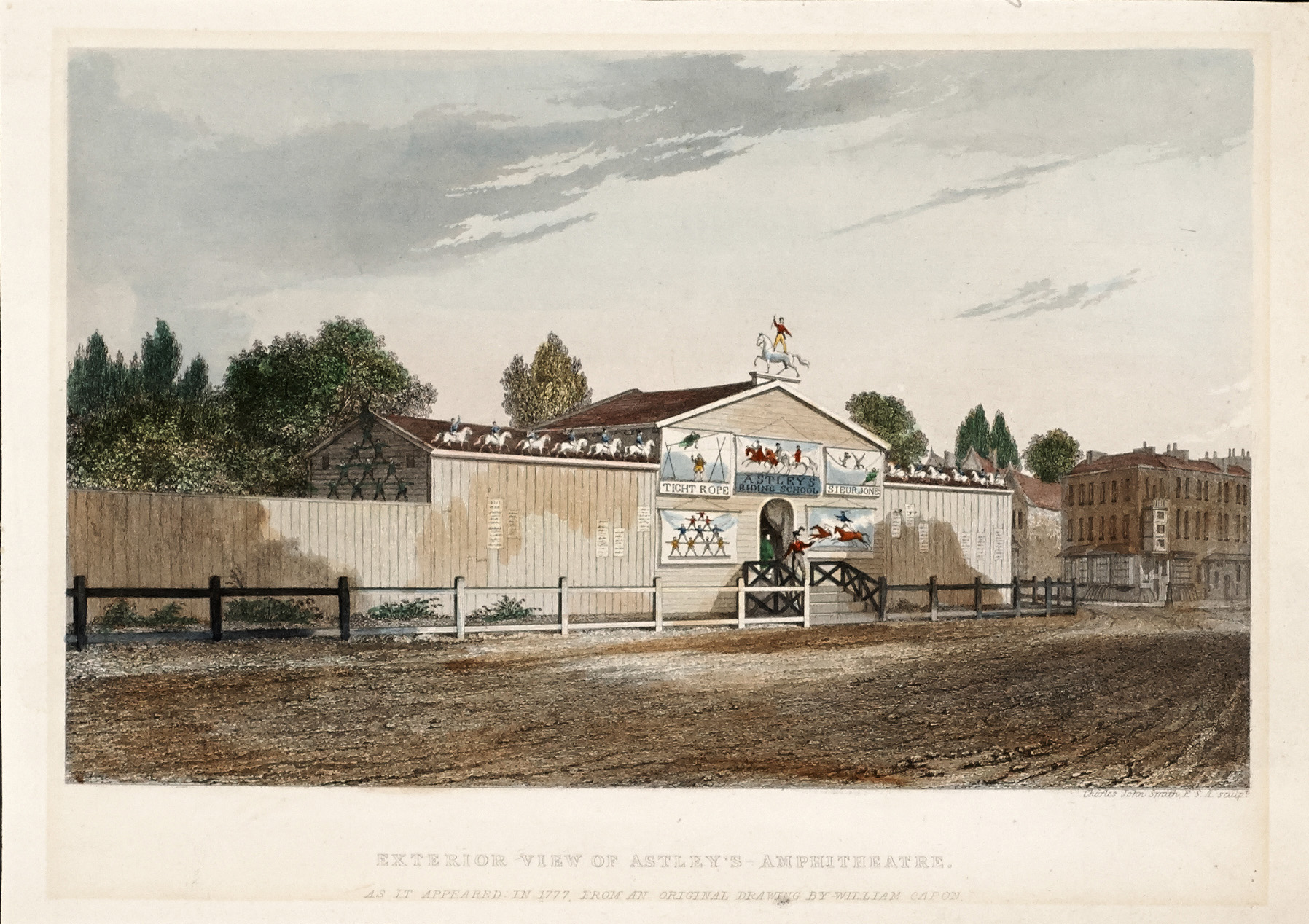
The exterior of Astley’s Amphitheater in 1877, as depicted in a drawing by William Capon, shows the early presence of pictorial imagery in circus advertising. The Ringling Museum, Tibbals Collection.
A wonderful etching depicting the exterior of his riding school around 1777 shows that artistic images of circus acts were already critical to building popular enthusiasm for the performance. In addition to the letterpress bills posted along the walls, presumably listing the highlights of the current performance, the large, colorful, hand-painted pictorial banners gave passers-by an idea of the amazing feats to be seen behind those walls. Whether in permanent structures like Astley’s original amphitheater or the many other buildings that sprang were constructed throughout Europe or traveling across countries in tented pavilions, circuses have always employed fantastic visual imagery to transform the world around them.
The earliest printed advertisements were notices in newspapers and handbills, both basic forms of letterpress printing, which allowed for clean crisp lines of text using movable type in a variety of fonts and sizes. Small woodcut blocks were fit into rectilinear compositions to illustrate the text that listed acts and featured performers. Color was limited in early letterpress printing as each additional color required an additional carved block, plus the printing required multiple passes through the press, increasing production time, the chance for errors, and ultimately, the cost to the showman himself.[iii] This 1805 bill for a circus at Newcastle demonstrates the limitations of letterpress printing, with black and white images limited to the framed band around the text. These “cuts,” likely stock images reused for various shows, do not specifically illustrate the text, instead supplementing the feats described in the bill with images of additional equestrian tricks. The purpose of the images in these bills is two-fold – they serve to entice those who could not read while also illustrating the remarkable accomplishments of the performers to those who could not believe the words on the page.
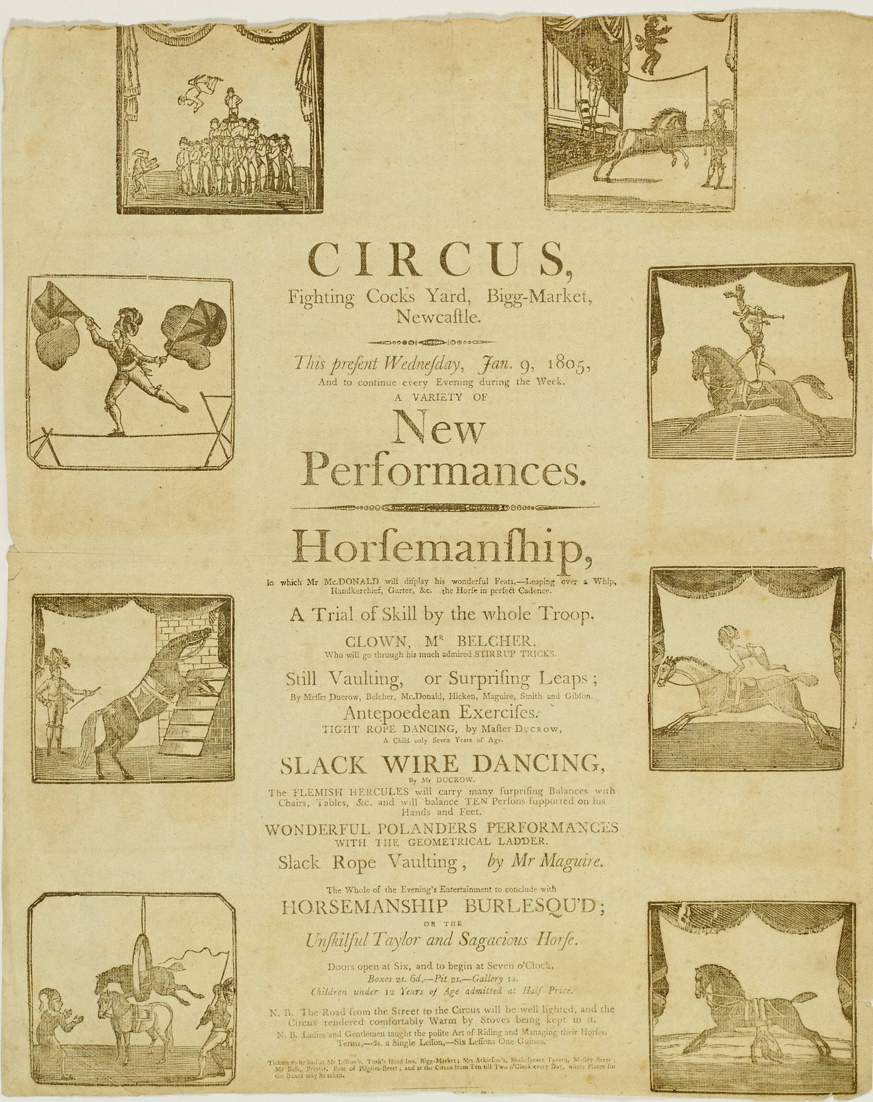
Small woodcut images supplement the list of acts to be seen at an 1805 circus in Newcastle. The Ringling Museum, Tibbals Collection.
It is this reliance on the relationship between word and image that made print advertising so important to the business of circus. In print, describing the wonders of any one act could easily become long-winded, much more so when describing an entire performance. But a still image or two or even eight could not conjure the magic of the performance either. By the early 19th century, the small images and linear compositions that characterized letterpress printing were not of the scale and excitement to embody the growing popularity of circuses and menageries. In the United States, just as the business of the tented circus became a viable enterprise, printers were making advances in traditional woodcuts as well as an entirely new printing method – lithography. These changes to the print industry would lead to an explosion of color papering towns and cities announcing the coming circus day.
The first steam run press in America was built by Jonas Booth in 1822 and by the 1830s many of the larger American printers were using the steam powered press to run jobs on a scale never before possible. In that same period, engraver Joseph W. Morse introduced the use of pine blocks rather than the much more expensive mahogany and boxwood blocks traditionally used by printers. But using the softer pine for color tints, Morse’s innovation made large scale, full color letterpress printing an affordable undertaking. By the 1850s these printers had harnessed the tools of their craft to produce large scale, full color posters depicting a continuous image, rather than the individual cuts seen in earlier show prints. An 1851 poster for Driesbach and Co.’s Menagerie, measuring 2.75 meters in height by 3.8 meters in width, is one of the earliest large-scale pictorial posters still in existence. The four-color print depicts Adam and Eve’s expulsion from Paradise and includes the names of the three printing pioneers who created it: printer Jonas Booth, engraver Joseph Morse, and engraver and publisher T.W. Strong.
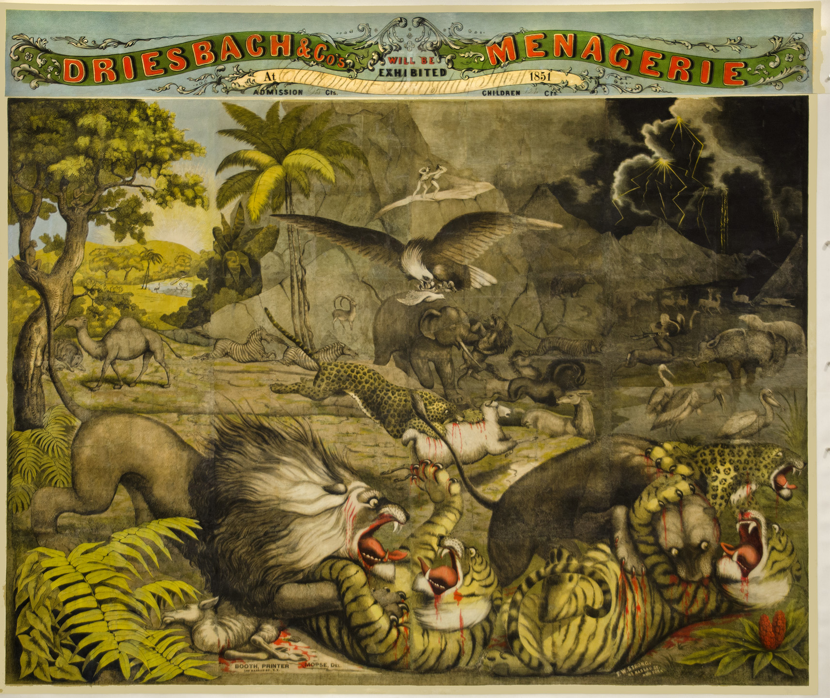
The large pictorial image and numerous colors in this 1851 poster for Driesbach’s menagerie made it an ambitious undertaking for printers of the time. The Ringling Museum, Tibbals Collection.
Just as the letterpress printers were achieving scale and color that brought to life the imagery of the traveling shows, a new printing method, lithography, was making its way to the States and would ultimately offer almost unlimited possibilities for show printing. The first commercial lithographic firms appeared in the United States around 1825, at about the same moment that enterprising American showman Joshuah Purdy Brown began presenting performances under a tent rather than in a permanent structure. It would be several decades more before lithographic prints became the preferred media for circus advertising, but again, the technology of the print industry developed in unison with the business of circus.[iv]
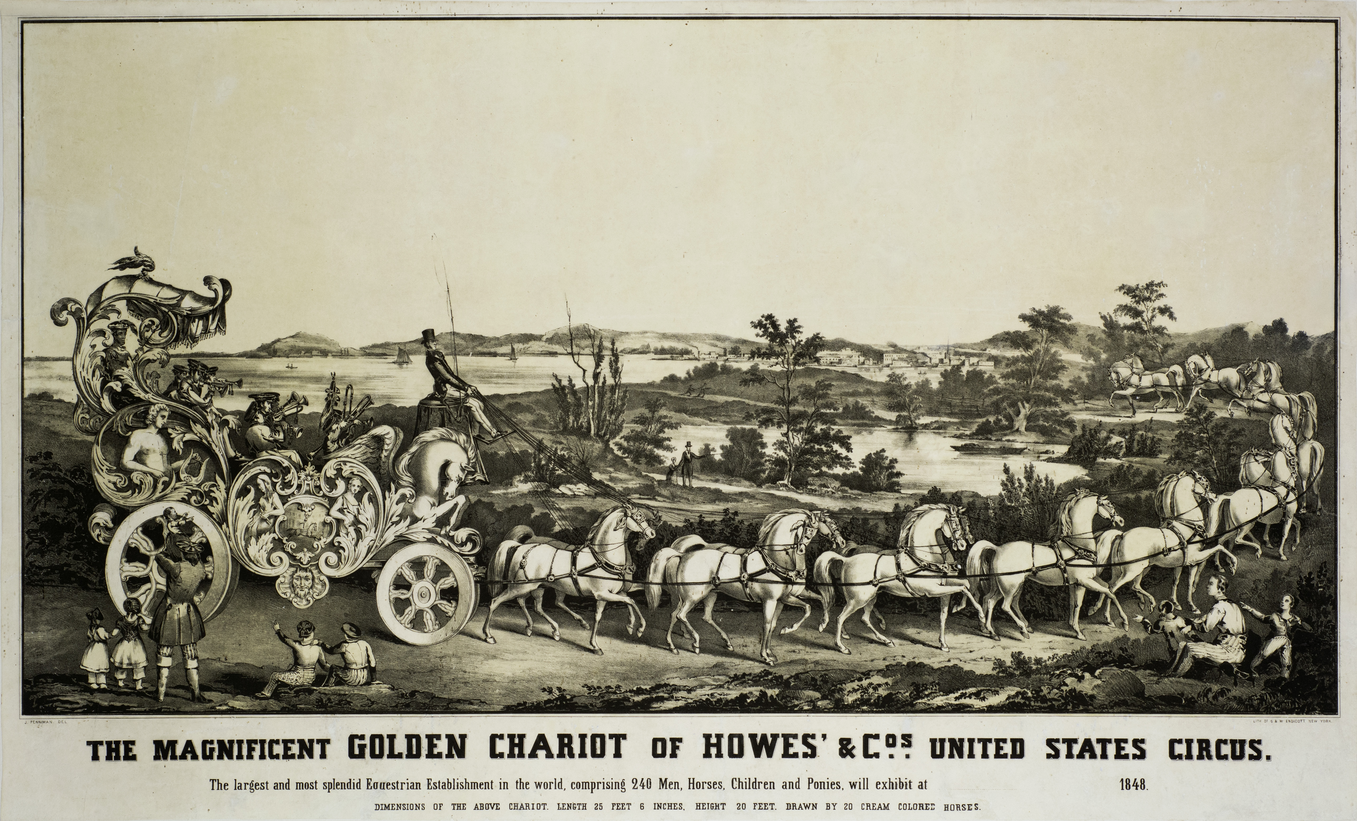
Around the mid-19th century, showmen began turning to commercial lithographers for beautifully printed images like this poster for the 1848 Howes’ and Co.s United States Circus.The Ringling Museum, Tibbals Collection.
With the addition of a splendid Golden Chariot to his show’s street parade, American showman Seth B. Howes commissioned the New York firm of William and George Endicott to produce one of the earliest show lithographs, depicting the grand bandwagon and listing its physical attributes to build excitement before the show ever arrived in a town. Viewed one hundred and seventy years later, the imagery in the Howes poster informs modern eyes of the great importance of spectacle to the success of circus, but also hints at the relationship of circus to the cultural concept of childhood and the circus’ long-standing appeal to children and families. Although printed in 1848, the image depicts the special relationship of fathers sharing the spectacle of circus with their children.
While the rendering of the Howes’ image is beautifully done, the poster’s monochromatic palette and linear text exiled to the margin, are signs that the industry had yet to embrace the full possibilities of the new printing method. The stylistic evolution of commercial printing took time, but the flexibility of lithography combined with the visionary talent of printing craftsmen like Booth and Morse gained momentum and quickly adapted to meet the demands of one of their most significant markets, show printing.
Later in the 19th century posters began to rely on iconic symbols of circus like clowns and elephants, such as those seen in this 1879 Adam Forepaugh poster. The Ringling Museum, Tibbals Collection.
A new generation of artists, epitomized by Matt Morgan, head of the art department at Strobridge Lithographing Company in Cincinnati, Ohio, further enhanced the significance of commercial lithography to the business of traveling shows. Hired in 1878, within a year, Morgan’s artistic style is evident in a burst of innovative designs created for a variety of American circuses in the 1879 season. Iconic symbols of circus began to emerge, particularly clowns and elephants. The elephant pyramid illustrated by Matt Morgan for Adam Forepaugh’s Great Aggregation, Menagerie, Museum, and Triple Circus is an early example of imagery that would be used by circuses for the next fifty plus years.[v]
The showmen themselves also became important symbols of their shows. With this 1889 poster, P.T. Barnum and his partner James Bailey were invoking and reinforcing the brand that they had carefully begun building many years before. The Barnum & Bailey circus stood for excellence and abundance in the highest quality. This is assured not only through the list of attractions and the bold declaration that the show is “Truthful, Moral, Instructive”, but also through the listing of their offices – Bridgeport, New York, and London – an international firm! The text is reaffirmed by the visual iconography of the laurel branches and the honest, upright portraits of the men themselves. In a subtle way, the suggestion of the show’s quality is emphasized by the high quality of the design itself. The balanced layout, the sweeping banners and rich colors combined with the beautifully rendered portraits implied that it was a high-quality show to be represented by such a fine impression.
The exceptional craftsmanship of commercial lithography from the last quarter of the 19th century through the first quarter of the 20th century left circus history with an abundance of beautiful prints that inform about trends, talents, and many of the most significant stars to grace the circus rings. Just as circus acts bridge countries and continents, so the art of circus advertising was in constant conversation across diverse regions, reflecting the artistic interests of the times. Lithographers in the United States and throughout Europe continued to refine their art and provide exception prints to announce the wonders of the circus arts.
The poster on the left printed by Adolph Friedländer showcased the talents of performers from throughout Europe. The Ringling Museum, Tibbals Collection.
The Strobridge poster on the right printed for the “Lady Clown” Evetta in 1903 shows the influence of European poster design. The Ringling Museum, Tibbals Collection.
European printers paralleled the advances of American counterparts. Adolph Friedländer founded his business in Hamburg, Germany in 1872 and by the end of the century the firm was producing some of the most beautiful show prints of the time. The comparison of two lithos produced around 1903 shows the close relationship between aesthetics that was often to be found in show printing. Friedländer’s litho advertising the performance of big cat presenter Claire Heliot and the image of Evetta produced by Strobridge are remarkably similar on first glance. The composition of each is focused on the female performer and her companion, with no scenic background, suggesting that the Evetta poster was inspired by the work of Friedländer and contemporary European printers, who often focused on a single figure or performance rather than a narrative image. But both prints clearly demonstrate the great craftsmanship of the printers with beautifully rendered figures and refined washes of color applied in perfect registration. The most significant difference is the presence of the Barnum & Bailey show title on the poster for Evetta. The inclusion of the title emphasizes the role of the business in the American circus experience, while the European print advertises the performer alone.
The circus posters of the early 20th century represent the apex of a complicated and mutually beneficial relationship between traveling shows, commercial printers, and spectators. The industry of printing had achieved an efficiency that allowed high quality lithographs to roll off presses by the thousands each day and the colorful paper was still the most immediate means of spreading excitement about the arrival of the show. The communities that were covered in the colorful circus papers were drawn into the represented world weeks before they would witness the performance. Experience of the posters allowed the spectators to build up the experience in their own imaginations only to be plunged into the rich and varied realities of the big top once the show arrived.[vi]
Although the need for print advertising waned in the second half of the 20th century, many still appreciated the artistry of circus posters like this one designed by Witold Janowski in 1969 for Poland’s Cyrk. The Ringling Museum.
By mid-20th century, the quality of commercial printing became more costly and many shows spent their advertising budgets on radio and television spots instead. In some cases, like the posters produced for the Polish state’s Cyrk, the artistic production of the advertising was embraced and elevated as part of the art of circus. But for most private showmen, one of a kind designs gave way to stock posters, and the difficulty in finding spaces to post bills led to the shrinking size of the printed pieces. Despite the growth of alternate media, printed advertisements still play a role in announcing the coming of the circus. Even now, 250 years later, season after season, showmen and performers return to the powerful combination of words and images to stir the imaginations and conjure excitement about the magic to be experienced in the circus ring rings.
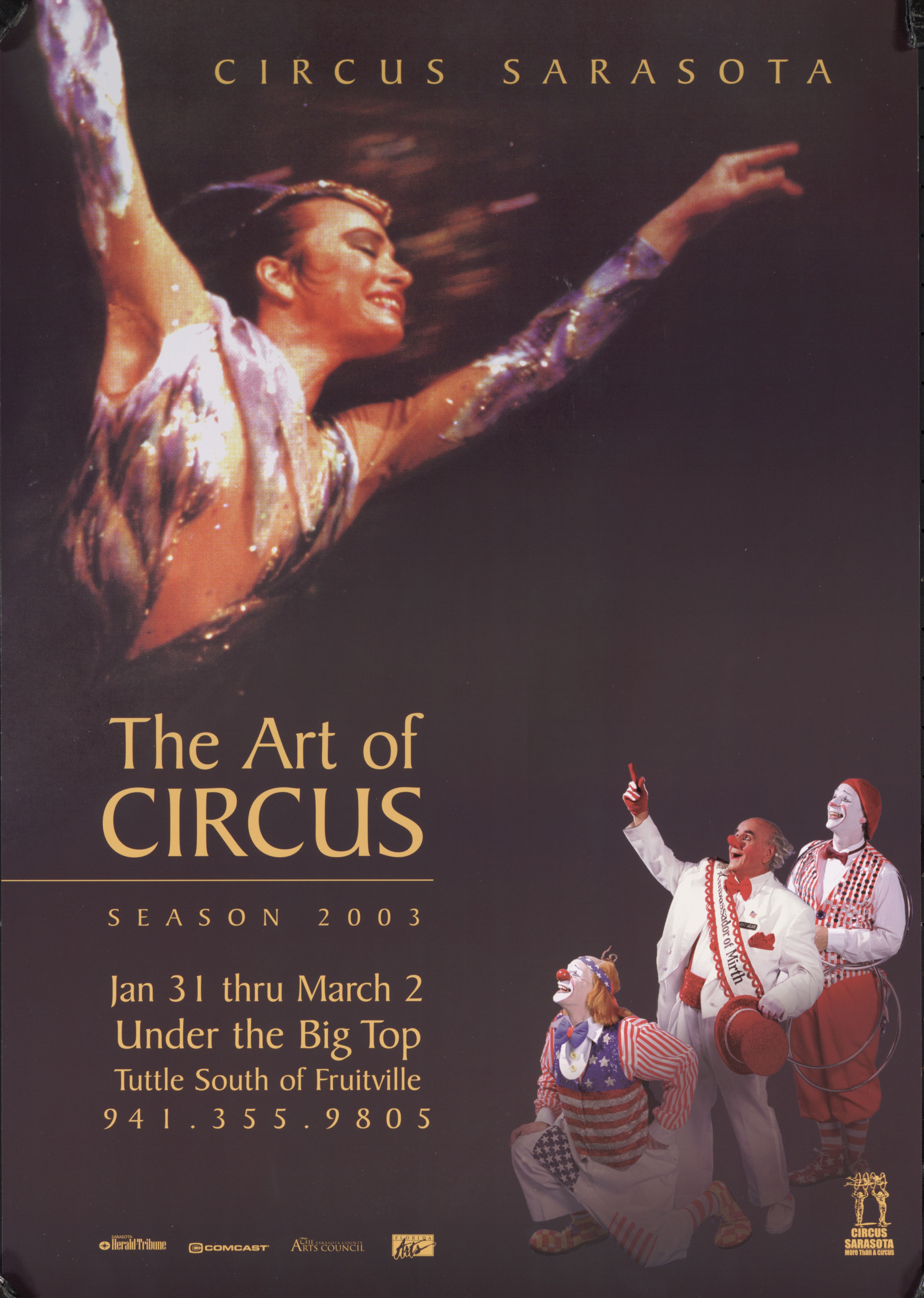
Even in the 21st century, the tangible experience of text and image in physical print is part of the marketing for many circus performances, like Sarasota, Florida’s own Circus Sarasota.The Ringling Museum, Tibbals Collection.
[i] her excellent examination of the intersection of circus and American culture, The Circus Age: Culture and Society Under the American Big Top,Janet Davis discusses the “Spectacle of Labor” as well as the American circus’ close relationship to the growing rail system.
[ii]Walter Benjamin, “The Age of Mechanical Reproduction,” in Vanessa R. Schwartz and Jeannene M. Przyblyski, The Nineteenth Century Visual Culture Reader, New York: Routledge, 2004. P. 63-70.
[iv]For an excellent overview of American letterpress printing and its relationship to traveling shows, see Richard W. Flint, “’A Great Industrial Art’: Circus Posters, Business Risks, and the Origins of Color Letterpress Printing in America,” Printing History Vol. 25, No. 2, 2007. P. 18-43.
[v]The history of Strobridge and its artists have been covered in a number of publications, must especially in Kristin Spangenberg, “The Strobridge Lithographing Company: The Tiffany of Printers,” The Amazing American Circus Poster: The Strobridge Lithographing Company, Cincinnati: Cincinnati Art Museum, 2011.